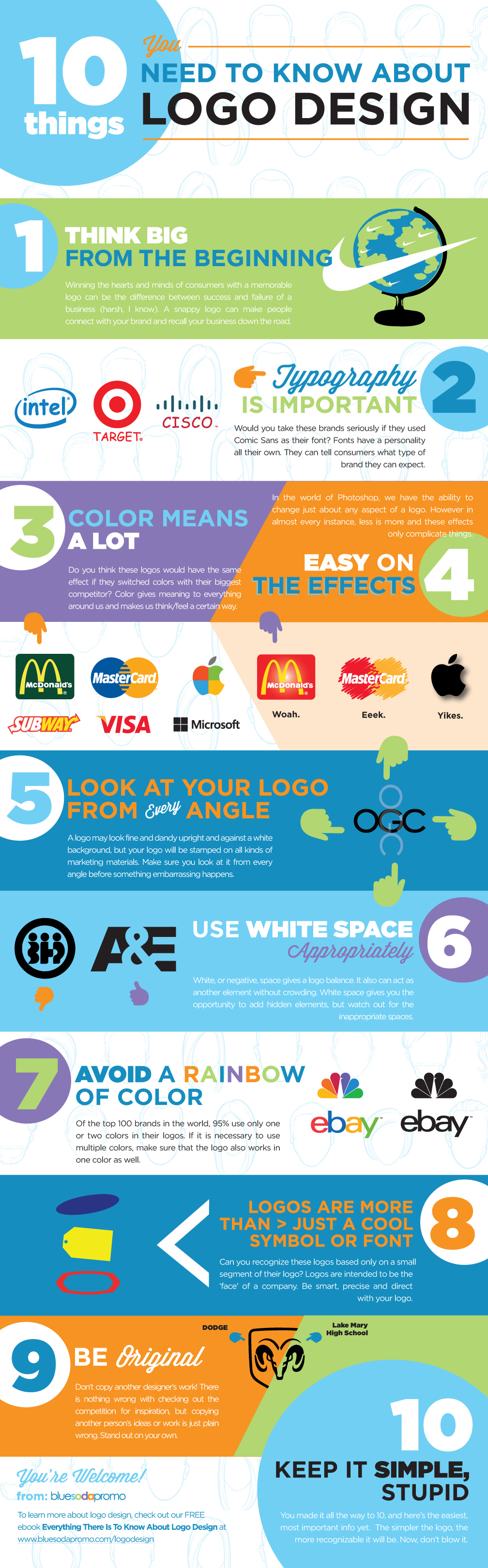
10 THINGS YOU NEED TO KNOW ABOUT LOGO DESIGN

10 THINGS YOU NEED TO KNOW ABOUT LOGO DESIGN

[INFOGRAPHIC]

Nike’s swoosh, McDonalds’s golden’s arches, and Apple’s bitten fruit all have one thing in common… Well, that’s not exactly true as you’ll find out later in this post. However! What they do share is the overarching success their logos have had on the world. People no longer need to be told what their logos represent. When their logos are stamped on something they have certain consumer expectations attached to it. Their logos became their own company’s spokespeople, while their products continue to prove their worth. For any start up or small business this is what they are looking to achieve. Yet for most, a logo is the last thing on their minds. They have ‘better’ things to do, whether it’s perfecting a product, running numbers, shipping orders, designing packaging, or creating a website. Touche. I get it. But! DO NOT forget about the logo. It is one of the most (if not the most) important pieces of marketing material in your arsenal. Giving your neighbor’s son — who is a computer wiz, I know — $50 to come up with a logo is not the answer. A logo is supposed to have meaning. A personality all it’s own. And above all, it describes what a company is all about. Some of these things may not be evident to us right away, or you may even think that logos can’t have an effect on you at all (think again: see the psychology of logo design), but I assure you that a logo has more to do with your company’s success than you think.

THAT BEING SAID, HERE ARE 10 THINGS TO THINK ABOUT WHEN DESIGNING A LOGO:

logo design infographic

EMBED THIS ON YOUR SITE

1. THINK BIG FROM THE BEGINNING

Winning the hearts and minds of consumers with a memorable logo can be the difference between success and failure of a business (harsh, I know). A snappy logo can make people connect with your brand and recall your business down the road. Identities are becoming less literal and instead more about the emotional connection one makes with it. Pro Tip: Spend the majority of the beginning stages sketching. Your first idea WILL NOT be your best.

2. TYPOGRAPHY IS IMPORTANT

Typography is so significant it can make or break a logo. Fonts have a personality all their own; they can tell consumers what type of brand they can expect. Pro Tip: Try at least 10-20 fonts before settling on one. Experiment with the size, spacing, and weight. You can even try creating your own custom font.

3. COLOR MEANS A LOT

Color gives meaning to everything around us and makes us think or feel a certain way. You also want to ensure that the colors you choose compliment one another. Pro Tip: Color theory can be tricky, but a basic understanding on how colors work can be a big advantage for your business.

4. EASY ON THE EFFECTS

In the world of Photoshop, we have the ability to change just about any aspect of a logo. However in almost every instance, less is more and these effects only complicate things. Pro Tip: If you choose to use one or more of these effects, your logo should not depend on it.

5. LOOK AT YOUR LOGO FROM EVERY ANGLE

A logo may look fine and dandy upright and against a white background, but your logo will be stamped on all kinds of marketing materials (check out Blue Soda Promo, its all we do!). Pro Tip: Make sure you look at it from every angle before something embarrassing happens, you’re out a ton of money, and back at square one!

6. USE WHITE SPACE APPROPRIATELY

White, or negative, space gives a logo balance. It also can act as another element without crowding. Pro Tip: White space gives you the opportunity to add hidden elements, but watch out for the inappropriate spaces.

7. AVOID A RAINBOW OF COLOR

Like we touched above, color is very important. Yet of the top 100 brands in the world, 95% use only one or two colors in their logos. Pro Tip: If it is necessary to use multiple colors, make sure that the logo also works in one color as well.

8. LOGOS ARE MORE THAN JUST A COOL SYMBOL OR FONT

Logos are intended to be the ‘face’ of a company. They don’t necessarily sell a company or product, but over time help build trust. Pro Tip: Be smart, precise, and direct with your logo.

9. BE ORIGINAL

Don’t copy another designer’s work! There is nothing wrong with checking out the competition for inspiration, but copying another person’s ideas or work is just plain wrong. Stand out on your own. Pro Tip: If you succeed, the last thing you want is to have your logo mistaken for someone else’s.

10. KEEP IT SIMPLE, STUPID

The simpler the logo, the more recognizable it will be. Its #10 on our list, but should be followed from the beginning. Break your logo down to only the absolute essentials. Do you really need that background element? Are all the colors need? Is the name even necessary? All these questions and more should be asked before you present your logo to the world.]]>

Back to Top