Visual Hierarchy
 This might be the most important design concept to teach. I’ve personally seen a huge shift in attitudes during design projects when a client understands that I’m structuring a hierarchy in the design to achieve a very specific purpose. Explaining it as follows has worked well:
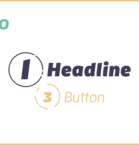
Every single piece of a design has a relative importance. On every page of a website, for example, there is 1 thing that is more important than anything else or that the visitor needs to see first. Then, there is also a second important item, and so on.
This is called a visual hierarchy. To create one, I make a list of all the items on the page in order of importance. Then, I use visual hints to present that relative importance.
An example of this is a headline font size, which is bigger than a subheader font size, which in turn is also bigger than the paragraph font size. This is a simple visual hierarchy, and applying the same strategy to every element in a design works the exact same way, except that I’ll use a variety of tools beyond size, such as color, contrast, or space.
How visual hierarchy matters for goals
A proper visual hierarchy will allow us to emphasize the important parts in a design so that your audience doesn’t miss them.
It will direct people to do the thing you want them to do—the call to action or CTA—like purchasing a product, filling out a form, or learning an important piece of information.
Visual hierarchy is how you get what you want from the design we’re making together. Having no hierarchy in a design is like drinking from a firehose; upon first glance, the reader doesn’t know where to look. We want to decide where they look first and then guide their eyes to the next important element too.
This might be the most important design concept to teach. I’ve personally seen a huge shift in attitudes during design projects when a client understands that I’m structuring a hierarchy in the design to achieve a very specific purpose. Explaining it as follows has worked well:
Every single piece of a design has a relative importance. On every page of a website, for example, there is 1 thing that is more important than anything else or that the visitor needs to see first. Then, there is also a second important item, and so on.
This is called a visual hierarchy. To create one, I make a list of all the items on the page in order of importance. Then, I use visual hints to present that relative importance.
An example of this is a headline font size, which is bigger than a subheader font size, which in turn is also bigger than the paragraph font size. This is a simple visual hierarchy, and applying the same strategy to every element in a design works the exact same way, except that I’ll use a variety of tools beyond size, such as color, contrast, or space.
How visual hierarchy matters for goals
A proper visual hierarchy will allow us to emphasize the important parts in a design so that your audience doesn’t miss them.
It will direct people to do the thing you want them to do—the call to action or CTA—like purchasing a product, filling out a form, or learning an important piece of information.
Visual hierarchy is how you get what you want from the design we’re making together. Having no hierarchy in a design is like drinking from a firehose; upon first glance, the reader doesn’t know where to look. We want to decide where they look first and then guide their eyes to the next important element too.
Alignment
 In my opinion, the easiest way to tell if a design is made by an experienced designer is alignment. Regardless of whether you agree, the grid is a serious matter; it makes or breaks design. It’s simple to explain, but difficult to do well. However, non-designers don’t need to master it. They only need to learn why you arrange elements the way you do. Explain it like this:
Alignment is part of how elements are arranged on a page; it’s just like aligning a paragraph to the right or left in Word or Google Docs.
To use alignment properly, imagine there are evenly-spaced vertical lines running through the entire length of the design. The left and right edges of every single item should fall along these lines, which we designers call a grid.
We want to align as many items as possible along the same grid lines.
How alignment matters for goals
Properly aligned compositions look vastly more professional. It’s a major factor in whether a design looks trustworthy.
Further, alignment makes a design more neat and organized so that it’s easier to read or use. This means that your readers will find what they want without frustration. They’ll be more likely to take the action you want them to perform and more likely to stay put.
In my opinion, the easiest way to tell if a design is made by an experienced designer is alignment. Regardless of whether you agree, the grid is a serious matter; it makes or breaks design. It’s simple to explain, but difficult to do well. However, non-designers don’t need to master it. They only need to learn why you arrange elements the way you do. Explain it like this:
Alignment is part of how elements are arranged on a page; it’s just like aligning a paragraph to the right or left in Word or Google Docs.
To use alignment properly, imagine there are evenly-spaced vertical lines running through the entire length of the design. The left and right edges of every single item should fall along these lines, which we designers call a grid.
We want to align as many items as possible along the same grid lines.
How alignment matters for goals
Properly aligned compositions look vastly more professional. It’s a major factor in whether a design looks trustworthy.
Further, alignment makes a design more neat and organized so that it’s easier to read or use. This means that your readers will find what they want without frustration. They’ll be more likely to take the action you want them to perform and more likely to stay put.
Proximity
 You could explain all the Gestalt Principles, but I’ve found that doing so confuses non-designers and provides way more detail than necessary. That said, proximity is a simple and important concept. It’s also very easy to relate to goals.
Proximity is about grouping items within a design. There’s a ton of psychological research about spatial relationships, but the part you need to know is that we can use this psychology to increase a person’s understanding of a design.
When a person sees a grouping of items, they infer a relationship between them. So, you can group items within a design to imply that they are related, so that the person doesn’t have to read every single one of them to know what they are or what they do.
How proximity matters for your goals
With proximity, a reader will spend less time reading—they’ll be able to find what they want more quickly because they can scan through the composition and understand the function of elements without studying each one individually.
Proximity increases the speed at which people understand an interface or presentation and thus makes it easier to use. This is critical for meeting your goals.
You could explain all the Gestalt Principles, but I’ve found that doing so confuses non-designers and provides way more detail than necessary. That said, proximity is a simple and important concept. It’s also very easy to relate to goals.
Proximity is about grouping items within a design. There’s a ton of psychological research about spatial relationships, but the part you need to know is that we can use this psychology to increase a person’s understanding of a design.
When a person sees a grouping of items, they infer a relationship between them. So, you can group items within a design to imply that they are related, so that the person doesn’t have to read every single one of them to know what they are or what they do.
How proximity matters for your goals
With proximity, a reader will spend less time reading—they’ll be able to find what they want more quickly because they can scan through the composition and understand the function of elements without studying each one individually.
Proximity increases the speed at which people understand an interface or presentation and thus makes it easier to use. This is critical for meeting your goals.
Spacing
 We designers are often criticized for our use of white space. Some critics view it as a fashion statement or exercise in minimalism. You’ve probably had people ask why they can’t just fill the empty spaces with more text or photos. Obviously, doing that is going to make the design very difficult to read and use. I explain spacing like this:
Punctuation is to writing as spacing is to design. Correct use of space in a design will provide a rhythm and pace for easy reading and use.
Lack of spacing is like run-on sentences or wordsthatruntogether. (See what I did there?) It is frustrating and difficult to wade through. When people browse a design without spacing they get frustrated and give up.
How spacing matters for goals
Proper space enhances usability and readability.
Spacing isn’t a fashion statement, like some design critics might claim. It’s a tool I use to enhance the clarity of your composition.
You wouldn’t want me to use a tiny font size that people couldn’t read, right? Well, we need the empty space so that the surrounding elements are easier to read. If we cram them all together, it’s much more difficult.
We designers are often criticized for our use of white space. Some critics view it as a fashion statement or exercise in minimalism. You’ve probably had people ask why they can’t just fill the empty spaces with more text or photos. Obviously, doing that is going to make the design very difficult to read and use. I explain spacing like this:
Punctuation is to writing as spacing is to design. Correct use of space in a design will provide a rhythm and pace for easy reading and use.
Lack of spacing is like run-on sentences or wordsthatruntogether. (See what I did there?) It is frustrating and difficult to wade through. When people browse a design without spacing they get frustrated and give up.
How spacing matters for goals
Proper space enhances usability and readability.
Spacing isn’t a fashion statement, like some design critics might claim. It’s a tool I use to enhance the clarity of your composition.
You wouldn’t want me to use a tiny font size that people couldn’t read, right? Well, we need the empty space so that the surrounding elements are easier to read. If we cram them all together, it’s much more difficult.
Contrast
 This concept is often misunderstood; most people think that contrast refers only to the difference between colors. As you know, that’s only a partial definition. Here’s what I tell people:
Contrast is a visual difference that we can achieve in any number of ways. Certainly color is one option, but elements that differ in size, position, space, typography styles, and other qualities contrast one another too.
How contrast matters for goals
This distinction is important because I use contrast to add emphasis or to visually reinforce meaning. It’s a big part of creating a visual hierarchy, too. Therefore, by varying contrast throughout a composition, the design will guide people to the important parts.
This concept is often misunderstood; most people think that contrast refers only to the difference between colors. As you know, that’s only a partial definition. Here’s what I tell people:
Contrast is a visual difference that we can achieve in any number of ways. Certainly color is one option, but elements that differ in size, position, space, typography styles, and other qualities contrast one another too.
How contrast matters for goals
This distinction is important because I use contrast to add emphasis or to visually reinforce meaning. It’s a big part of creating a visual hierarchy, too. Therefore, by varying contrast throughout a composition, the design will guide people to the important parts.
Repetition
 When most non-designers hear of repetition, they picture a mirror image or a pattern. They think repetition means just duplicating and reusing the exact same element. Of course, it’s really about building consistency within a design. Here’s an example I often use to explain this:
Readers need to be able to distinguish section headers from subheaders. If every header had a different font size, it would be impossible to tell whether each was a header or subheader. You use repetition to make this clear, by using the exact same font size for every header, and a second style for all subheaders. This way, readers understand the structure of the content.
Also clarify that repetition is important for the exact same reason for other aspects of a design, like color and spacing; a design should have a limited color palette that is applied in a consistent, repetitive way and equal spacing around elements.
How repetition matters for goals
Designs that use repetition look professional and earn trust, but they are also easier to understand because of consistency. This is another of those less conspicuous design theories; non-designers might not notice repetition when it’s used well but they will certainly notice when a design lacks it. So, consider pointing out how you use repetition to make type systems and color schemes. The value of what we designers do isn’t always immediately obvious upon first glance.
—
Note: Many non-designers get frustrated at this point. They think we are suggesting both contrast and repetition which is contradictory. It absolutely is. Deciding which to use is a skill, and this is where you should be showing your value as an expert. So, point out why you use one or the other when you present your work.
—
When most non-designers hear of repetition, they picture a mirror image or a pattern. They think repetition means just duplicating and reusing the exact same element. Of course, it’s really about building consistency within a design. Here’s an example I often use to explain this:
Readers need to be able to distinguish section headers from subheaders. If every header had a different font size, it would be impossible to tell whether each was a header or subheader. You use repetition to make this clear, by using the exact same font size for every header, and a second style for all subheaders. This way, readers understand the structure of the content.
Also clarify that repetition is important for the exact same reason for other aspects of a design, like color and spacing; a design should have a limited color palette that is applied in a consistent, repetitive way and equal spacing around elements.
How repetition matters for goals
Designs that use repetition look professional and earn trust, but they are also easier to understand because of consistency. This is another of those less conspicuous design theories; non-designers might not notice repetition when it’s used well but they will certainly notice when a design lacks it. So, consider pointing out how you use repetition to make type systems and color schemes. The value of what we designers do isn’t always immediately obvious upon first glance.
—
Note: Many non-designers get frustrated at this point. They think we are suggesting both contrast and repetition which is contradictory. It absolutely is. Deciding which to use is a skill, and this is where you should be showing your value as an expert. So, point out why you use one or the other when you present your work.
—
Color
 You might completely disagree with me here, but stick with me.
In my first book, I wrote that color is the most difficult part of design to master, and I still feel that way. You can study color theory or use the color wheel and gain zero knowledge that will help you to actually pick colors and use them in a design.
The color wheel is basically the Wheel of Fortune. You can spin it, and no matter where the pointer lands, you end up with a puzzle. So I say: refuse to play the game.
This is where the true value of an expert designer is hidden. When a non-designer sees a nice design, they don’t realize how much experience is required to get the colors just right. They’re oblivious of how difficult this really is until they try to pick colors themselves, and nothing looks right.
Color Theory is a complex topic. It includes: the emotion of color, which is vague and often conflicting; primary, secondary, tertiary, and complementary colors, which are functionally useless after Kindergarten; and the color wheel, which is the direct cause of much confusion and frustration.
We designers navigate all these complicated factors well, but they are guaranteed to confuse the non-designers you work with. Here’s a list of points you can use to teach people how color works in design:
You might completely disagree with me here, but stick with me.
In my first book, I wrote that color is the most difficult part of design to master, and I still feel that way. You can study color theory or use the color wheel and gain zero knowledge that will help you to actually pick colors and use them in a design.
The color wheel is basically the Wheel of Fortune. You can spin it, and no matter where the pointer lands, you end up with a puzzle. So I say: refuse to play the game.
This is where the true value of an expert designer is hidden. When a non-designer sees a nice design, they don’t realize how much experience is required to get the colors just right. They’re oblivious of how difficult this really is until they try to pick colors themselves, and nothing looks right.
Color Theory is a complex topic. It includes: the emotion of color, which is vague and often conflicting; primary, secondary, tertiary, and complementary colors, which are functionally useless after Kindergarten; and the color wheel, which is the direct cause of much confusion and frustration.
We designers navigate all these complicated factors well, but they are guaranteed to confuse the non-designers you work with. Here’s a list of points you can use to teach people how color works in design:
- Humans interpret color relative to other nearby colors
- Color inspires emotion
- Color contrast is important for readability and usability
- Color blindness is surprisingly common: color should never be the only visual tool you use to supply information, no matter the medium
- In design, color should be used consistently; every design should have a color scheme and a specific use for each color it includes
Typography
 To non-designers, picking out fonts is fun and trivial. This is also how typography betrays them.
Using typography well requires a practiced hand, but they don’t know this. They’ve certainly heard the rumbling about how Comic Sans and Papyrus are bad fonts but doubtlessly use them anyway.
When discussing typography or dealing with someone who says they “don’t like that font,” instead of using type terms to explain why it’s a good choice, cut to the underlying goal.
Explain that while decorative fonts are fun and expressive, they aren’t appropriate for every design. Remind them of their goals, and explain how that handwriting font isn’t fitting for a financial company logo, for example.
Another anecdote I enjoy telling is about Arial. It goes like this:
“I bet that you think Arial is a boring font. Let me tell you a little secret: Arial is nearly identical to its widely-used cousin with a sexier reputation: Helvetica. Even most professional designers cannot tell the difference between Arial and Helvetica, unless the sample has an uppercase ‘R’ or a lowercase ‘a’.”
It’s a great way to explain how complex typography is, while setting yourself up as the expert. There’s no way a non-designer is going to be able to tell apart Arial and Helvetica, and when you explain that you can, you’ll get instant respect and they’ll start to back away from the idea of using Papyrus.
A different example, shown above, is to teach that a modern typeface design looks completely different from what most would expect. When they think “modern”, non-designers are usually picturing something like Helvetica Light, but you and I know that modern typefaces are something very, very different.
How typography matters for goals
Type is one of the most powerful tools that we designers have available. It’s a lot like the tone of writing or the psychology of color. It is a key component in establishing which emotions a design evokes. Of course, typography also affects readability. It ultimately helps determine people understand and judge a design.
Words by: Jarrod Drysdale]]>
To non-designers, picking out fonts is fun and trivial. This is also how typography betrays them.
Using typography well requires a practiced hand, but they don’t know this. They’ve certainly heard the rumbling about how Comic Sans and Papyrus are bad fonts but doubtlessly use them anyway.
When discussing typography or dealing with someone who says they “don’t like that font,” instead of using type terms to explain why it’s a good choice, cut to the underlying goal.
Explain that while decorative fonts are fun and expressive, they aren’t appropriate for every design. Remind them of their goals, and explain how that handwriting font isn’t fitting for a financial company logo, for example.
Another anecdote I enjoy telling is about Arial. It goes like this:
“I bet that you think Arial is a boring font. Let me tell you a little secret: Arial is nearly identical to its widely-used cousin with a sexier reputation: Helvetica. Even most professional designers cannot tell the difference between Arial and Helvetica, unless the sample has an uppercase ‘R’ or a lowercase ‘a’.”
It’s a great way to explain how complex typography is, while setting yourself up as the expert. There’s no way a non-designer is going to be able to tell apart Arial and Helvetica, and when you explain that you can, you’ll get instant respect and they’ll start to back away from the idea of using Papyrus.
A different example, shown above, is to teach that a modern typeface design looks completely different from what most would expect. When they think “modern”, non-designers are usually picturing something like Helvetica Light, but you and I know that modern typefaces are something very, very different.
How typography matters for goals
Type is one of the most powerful tools that we designers have available. It’s a lot like the tone of writing or the psychology of color. It is a key component in establishing which emotions a design evokes. Of course, typography also affects readability. It ultimately helps determine people understand and judge a design.
Words by: Jarrod Drysdale]]>