All logo designers know and value the importance of a professional logo to any business, large or small. It represents the company, it tells their story and symbolises their brand to the world. Viewed daily by their clients and potential customers, it could jeopardise, even ruin the success of the company it acts for if poorly designed.
No matter how great your products or services are, if your logo sucks, you’re going to have a hard time attracting customers to your business. This is the primary reason companies today are investing so much time, effort and money in hiring the top logo designers and brand agencies to try and create the best logo they possibly can.
It is not easy to design logos – I know. Even the most respected designers in the industry encounter challenges when it comes to creating highly professional and effective logos for their clients. Maybe more so than others, graphic designers are fully aware the significance a logo plays in the success of a business, hence the amount of time spent on stages of development throughout the process of creating the logo. It’s not enough that the logo ‘looks good’, it has to communicate the strategies, messages and ethos successfully. Even the smallest, simplest logo design can take days, weeks or months to materialise – design takes a lot of patience and hard work.
So in order to help designers (both new and experienced) lessen the amount of time, issues and headaches, I’ve compiled a list of the top 10 mistakes logo designers should avoid.
1: Copying, Plagiarising or Stealing Someone Else’s Logo

Copyright and trademark infringement is rife on the internet, not just for design, but for everything from media to ideas and intellectual property. One particular excuse I’ve heard is that with client’s undervaluing logo design to such an extent, the designer can’t afford to research and develop a unique design. This was admittedly in relation to crowdsourcing, where hundreds of designers compete to ‘win’ the chosen logo, with the rest not receiving a penny for their time. Irregardless, any serious and professional designer will know it is absolutely unacceptable to knowingly copy or steal someone else’s work.
Crossing your fingers and hoping to get away with it isn’t the best strategy. Put yourself in the position of the client, who has just paid you to create a new logo – if it turns out to be stolen or infringing on another businesses logo, not only will there be potential legal ramifications, but they will need to spend time and money to fix the problem that should never have come up in the first place.
I’ve found some of my own logos, created for my clients, often blatantly ripped off under the guise of another business. One Russian company for example, had literally used the logo from my portfolio, changing nothing! (Their name was the same as my client’s – not the smartest move). I feel bad for them, since they had no idea that their ‘designer’ had stolen it, also for my client who was immediately notified. After a polite email to the company, they removed it apologetically and got in touch with their creative genius to sort it out.
Even if the logo is not from a well-known brand, don’t risk stealing / copying another logo for your client in the hopes of making a quick buck.
2: Having a Vague or Overly-Complex Design

You’ve just started an exciting project and are working to a tight deadline. You have so many ideas in your head that they are bursting out of the sketchpads and onto the floor. In the excitement of the creative juices flowing, you’re deadline is catching up on you and you end up combining several of the strongest approaches into one.
The problem is, the final logo you propose to the client is a complicated design, sending various messages and ultimately lacking clarity.
Remember that one of the main purposes of a logo design is to communicate a message to the viewer about the company. If the logo isn’t clear, then how will an outside party, a potential customer for example, gain any understanding of the message being portrayed? If the potential customer reacts neutrally or even negatively to the brand image that you’ve created, then you as a designer have failed in your job.
The key here is to keep things simple instead of complicating it. Sure, you had a lot of interesting ideas, which is great, but you should have developed the strongest approaches rather than try to infuse them into a kind of Frankenstein logo.
Keep things simple, clear and meaningful.
3: Poor Colour Choices

Another common mistake a lot of designers seem to make is when making colour choices. Of course logos can be very colourful and vibrant as it’s one way to catch the eye and form a memorable brand image, but not every colour goes with each other.
When it comes to the art of designing logos, I believe all designers should work in black and white. It doesn’t matter if you’re designing a logo for a company that sells rainbows to Disney, working in the simplest form is essential for a logo’s timelessness and adaptability.
Check out online colour tools such as Adobe’s Color, where you can see the colour spectrum and use the sliders to create complimentary colour palettes that work well together. Although colour can be very subjective it’s important not to present jarring colour schemes that could put the client off the logo before they’ve really considered it properly. It’s actually a useful part of the logo design process to involve the client in, even if they are the least creative person in the world. Ask what colours appeal to them for the brand, and why? Ask them to collect colours that stand out, either through screenshots or scrapbooks and then form that as the basis for your colour development stages.
A secondary point to make here in regards to bad colour combinations lies in the ‘meaning’ of colour psychology in logos. If one client runs an eco-friendly, organic farm, and another runs a school for ballet – which would you assign green to? And which, pink? It seems like an obvious point to make, but think about what the colour means from a conceptual background before assigning to the messages you are trying to portray.
Start in black and white, only adding limited colours that both complement and make sense if required for the design.
4: Typographic Issues

Believe it or not, there are a lot of designers who make very basic, and critical mistakes when it comes to typeface and lettering used in their logo designs. Typography is one of the most important aspects when it comes to logos, and choosing appropriate fonts is part of the process. Here are just a few of the most common typography issues that designers commit:
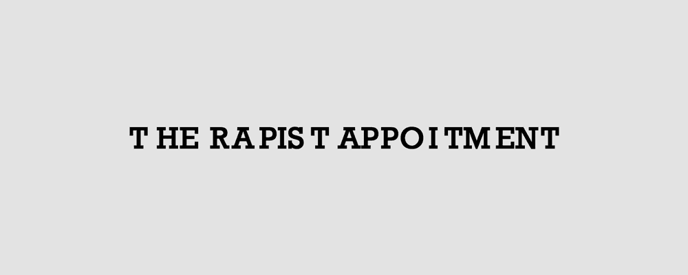
- Spacing – excessive spacing, or not enough spacing, can destroy legibility and readability at both large and small scales. Poor kerning especially can wreck the flow of the letterforms, and at it’s core, is bad for design. Make sure to choose fonts carefully and space correctly to be able to read even when scaled more than you would expect.
- Predictable or overused typefaces – We all know Times New Roman and Arial, they are the default, go-to fonts installed on every computer – be sure to experiment and check out other fonts on the market before taking the easy route.
- Ridiculous font choices – I have genuinely seen serious companies (or what at least attempts to be serious) using ‘professional’ logos attached to Papyrus and Curlz fonts. Don’t get me started on Comic Sans, although I can’t say I’ve ever seen a serious logo that uses it!
- Fonts with the extremities of weight – Excessively thin fonts can look glamorous. Super fat fonts can be playful and bold. However, for the majority of logos, a better balance needs to be struck between message and legibility. Whilst it may look great on a mocked-up billboard, how is that business card going to handle Helvetica Neue LT Std 25 UltraLightat 8pt?
- Using too many fonts in the same design – Three, four or even more fonts in the same design is simply over-complicating and confusing any message. Within logo designs, I recommend two at the most typefaces be used. My guide tends to fall with one primary ‘brand typeface’ that can be utilised across all corporate media, then, if they require a tagline for example, using a readable and complimentary typeface can work effectively.
Choose balanced and legible typefaces that can both be read at extreme sizes, but also convey the correct message for the brand.
5: Designing Logos That Aren’t Suitable for All Mediums

After creating what they think is the perfect logo, many logo designers call it a day and finalise the work with the client, without double checking it will work in all mediums. Most logos today will rarely appear solely in one format, rather a large range. Even if you’re branding a wine company that only prints their logo on the bottle labels – what happens in a year or two when they decide to get it embroidered on a uniform for staff only to find it won’t work? They’ll have to redesign after just one year – either that or they cannot innovate and expand.
This goes back to the idea of making sure you start in black in white, making sure that the logo design works in the simplest of forms and is adaptable for various media formats down the line. Generally speaking, if your logo holds up to being faxed, you’re okay – even though fax isn’t exactly popular nowadays.
Don’t create a logo that relies solely on stylisation or fancy effects to get the message across – it must work in the simplest of forms.
6: Designing for Your Portfolio Instead of the Client’s Needs

A selfishly designed logo is something that the designer has created with only themselves in mind, rather than the success of their client. The problem with some designers is that they focus on how the logo will look in their portfolio, maybe they’ve done that style before and will deliberately do something different so their work appears to have variation. Designing a logo that puts yourself before the client isn’t why they’ve hired you, they want your honest advice, strategy, and basically, they want you to create for them the strongest and most suitable logo design possible.
Similarly, if you have a ‘style’ of design, sometimes it may not be suitable for a particular project. Instead of forcing it to fit your ‘look’, drop the arrogant mentality and put them first.
Design should never say, Look at me. It should always say, Look at this – David Craib
Before you begin creating a logo, make sure that you know what the company’s goals are and keep them in mind when working on the concepts. Remember that it is not all about you. Instead, it is about your client trying to reach out to their target audience in order for their company to be successful.
Designing a logo that puts you before the client isn’t why they’ve hired you. Put them first.
7: Using Clipart and/or Stock Imagery

Don’t laugh, it happens! As with designers using the Papyrus font for a logo, I’ve seen more clipart and overused template logos than is really desirable. Clipart is no longer the silly illustrations that came bundled with Windows 95 – clipart has taken on a new form in logo design, through the abstract symbols sold on stock photo sites. Not only do they lack meaning (most of which fall under mistake #2 in this list) but reverse-application of meaning only dilutes the entire thing completely.
No one that calls themselves a professional logo designer should ever consider using these re-sellable template options for client work. Unique and appealing are two words that should fit a custom logo design, neither of which apply to the overused, cliched, swoosh round a globe mark that has 15,000 sales on some stock site at $5 a piece.
Logos that come with these types of images are cheap to look at and are definitely not a great way to establish a company branding.
Always come up with original work for your client and they will certainly thank you for it.
8: Unnecessary Inclusions

There are certain characters, symbols and elements that are’t actually necessary to include in a logo. For example, is no need to include “Co.”, “L.L.C.”, “Inc.”, etc. when creating the logo for a company; although some clients may request an adaption of the primary logo with symbols such as the Trademark (TM), Registration symbol (®) or Copyright (©) which is fine. Part of the logo design process is to simplify and reduce superfluous elements within the design to get to the core forms – having these additional, unnecessary items is only distracting from the logo itself.
In any project where I’ve been requested to include items like the above, I’ve always been sure to ask, “Are you required by law to include this in the logo?” with the usual answer being “well… no.”
If something isn’t needed, get rid of it. Simplify!
9: Not Using the ‘Correct’ Logo Design Software

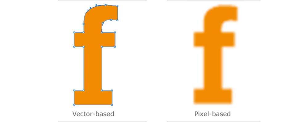
If you really want to be a professional, using the right logo design software is essential. I have been criticised by other designers for saying that you ‘must use Adobe Illustrator’, but I stand by my point. That point, by the way, is in reference to creating logos in vector form instead of bitmap – I am in no way affiliated with or firmly attached to Adobe by any means, quite simply, it’s the best software out there currently for designing logos professionally.
Some of you reading this may use another vector design application (I believe CoralDraw is the next favourite?) and that is absolutely okay for logo design. The important, nay critical, point to draw attention to is that the best logo design software is vector-based, not something like Photoshop which is raster. The first logo I ever created was in Adobe Photoshop and it worked well initially, that is, until the client emailed me asking for a larger version for a poster – when I enlarged, it naturally blurred out of focus and there was no easy fix. I had to quickly learn Illustrator, recreate in vector form then email over all new files with an explanation.
Having your logo files in vector format will solve 99% of potential issues you could come across. If it’s too small, enlarge it and export. If it needs to be a different shade of blue, no problem, select the colour, update the file and export. Basically, it cuts out a lot of work in the long run. If you are reading this and the only logo files you have are raster files (JPEG, PNG, PSD etc.) then I would advise getting in touch with a designer to vectorise or recreate it in a professional format.
Logos created using Photoshop are raster images and this means that they get pixilated if their scale is decreased or increased.
10: Lacking a Process for Designing Logos

Another reason why a lot of designers often spend a lot of time in designing the logo, yet cannot seem to come up with the final result that they want is because they just do not have the proper design process to follow. As with everything, it is always a good idea to have a set of stages that you need to adhere to when working. Sometimes, and especially with young designers, they are just too eager to finalise concepts that they immediately start sketching only to end up repeating the various stages over and over again, when their knowledge of the message that needs conveyed doesn’t exist.
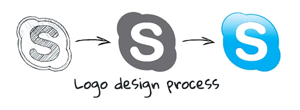
When creating any design, the first step is to do your research. Read and understand the creative brief properly and if there are things that are not clear to you, ask your client about it before you proceed. If you have understood everything,then that’s when you can start exploring and sketching. After sketching, the next step is to get it onto the computer in digital, vector form. Final stage is the presentation and this is where you decide the colours to use, font styles, etc.
Take a look at my own logo design process to see the various steps I follow when creating logos for clients. Once you’ve worked on a few projects, smoothly following each stage, you begin to do it naturally and after a while it becomes ‘your’ process, how you work and improves creativity, efficiency and of course results!
]]>Research case-studies of other logo designers to see how they get from design brief to end product. Having an in-depth process of creating logos will allow you to focus on the actual design itself.
Avoiding these all too common logo design mistakes is basically half the battle won. Using your skills and expertise, you will be able to finish your job in a reasonable amount of time with no headaches. What other common mistakes have you seen in logo design, feel free to leave a comment below.

